
Let's get one thing straight: when Google looks at your website, it's not seeing your fancy desktop design first. It’s looking at your mobile site. That’s what mobile-first indexing is all about.
Think of your mobile website as the definitive version of your MSP. If that version is clunky, slow, or missing crucial information about your services, that's how Google sees you. For potential clients searching for IT support, you might as well be invisible.

It wasn't that long ago that your desktop website was the main event. The mobile version? Often just a simplified, sometimes neglected, afterthought. That entire paradigm has been turned upside down. Google now builds its entire understanding of your website based on what it finds on a smartphone.
This isn’t just some minor algorithm tweak. It's a massive shift that directly impacts your ability to generate leads. Imagine a business owner searching for "managed IT services" on their phone. If your site is a pain to navigate on that small screen, they're gone. They will hit the back button and find a competitor whose site just works.
This change is simply a reflection of reality. Mobile devices dominate web traffic, and Google’s job is to serve the majority of users. So, their crawlers started acting like mobile users.
The transition wasn't an overnight flip of a switch. Google started rolling out mobile-first indexing way back in 2018, made it the standard for all new sites in 2021, and finished moving everyone over by late 2023. For MSPs, this means the mobile experience you provide is the single most important factor for indexing and ranking. It affects what all users see in search results, regardless of the device they're using.
Ultimately, this new standard is directly tied to your business goals. A solid mobile experience gets you better rankings. Better rankings mean more visibility and, in turn, more qualified traffic to your site. It's that simple.
Your mobile website is no longer a "nice-to-have." It is the very foundation of your online presence and the primary lens through which Google judges your authority and relevance in the MSP space.
To get this right, your MSP needs to focus on a few non-negotiable areas:
These are core pillars of a much larger strategy. To understand how they connect with other foundational elements, you can check out our guide on what is technical SEO to see the bigger picture.

Before you start overhauling your site, you first need to know where you stand. Is your site already on mobile-first indexing? Thankfully, you don't need a developer on speed dial to find out. The most direct and reliable way to get this information is right inside your own Google Search Console account.
Think of Google Search Console (GSC) as your direct line to Google. It cuts through the noise and speculation, telling you exactly how the search engine sees and processes your website. If you haven't set it up yet, make that your number one priority.
Once you’re logged into GSC, finding your status is pretty simple. The URL Inspection Tool is your go-to for this task. Just pop any URL from your website into the search bar at the top of the dashboard.
The tool will run a quick analysis and then give you a comprehensive report on that page. You're looking for a specific line item in the "Coverage" or "Indexing" section: the Primary crawler.
If you see "Smartphone" listed as the primary crawler, then you're all set. That’s your confirmation that Google is using the mobile version of your site for indexing and ranking, which has been the default for all sites for some time.
For a faster, on-the-fly check of a specific page, Google’s Mobile-Friendly Test is a fantastic tool. While it won't confirm your site's indexing status, it gives you immediate feedback on whether a page has any obvious usability problems on a smartphone. It's great for quickly diagnosing layout issues.
So, to get a solid baseline of your site's mobile health, just follow these two steps:
Using these two tools gives you a clear and actionable starting point. You'll know exactly how Google is crawling your site and can quickly identify any red flags that might be turning away potential clients.
Let's cut through the technical jargon and talk about what this all means for your bottom line. A clunky, slow-loading mobile website isn't just a minor annoyance; it’s a hole in your sales pipeline. Every potential client who bounces because your site is unusable on their phone is a lead you just handed to your competition.
Think about the search terms that really matter to your business, like "managed IT services in [City]" or "outsourced cybersecurity support." When a decision-maker searches for these phrases, they're actively looking for a solution. A stellar mobile experience doesn't just help you rank higher; it's a critical part of their first impression and directly influences whether they pick up the phone to call you.
The link between mobile speed, user behavior, and actual sales is crystal clear. We're talking about seconds, even milliseconds, determining whether you win a new client or they give up and click on the next result.
This isn't just a hunch; the numbers don't lie. Websites properly optimized for mobile see their rankings improve by 15-25% on average compared to those that aren't. That’s a massive advantage, especially when the #1 organic result pulls in about 27.6% of all clicks. For an MSP in a competitive market, that boost can be the difference between dominating the first page and getting lost on page two. You can see more on this in recent SEO research.
This performance boost creates a positive domino effect throughout your entire sales funnel.
Every single element of your mobile site should be designed with one goal in mind: making it incredibly easy for a prospect to become a lead. The name of the game is removing friction.
If a potential client has to pinch and zoom to read about your services, that's friction. If your contact form is a nightmare to complete on a touchscreen, that's friction. Each point of friction pushes them one step closer to leaving.
Aligning your mobile experience with what your users are actually trying to accomplish is the cornerstone of a successful strategy. To get a better handle on this, check out our guide on what is search intent. When you optimize for the mobile user, you're not just checking a box for Google. You're building a more reliable and effective lead generation engine for your business.
Alright, let's roll up our sleeves and get practical. Knowing your site is on mobile-first indexing is one thing; making sure it thrives there is how you start getting more calls and form fills. This technical checklist is your game plan for getting your MSP's website in shape.
Think of it as the blueprint for making sure Google's smartphone crawler sees your site as the go-to resource in your area. In today's search world, getting these details right is no longer optional.
This image really drives home the connection between a solid mobile experience and bringing in new business.
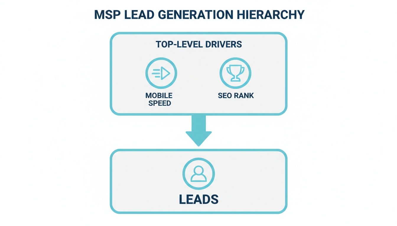
As you can see, a fast, well-built mobile site directly fuels your SEO rank, which in turn opens the floodgates for qualified leads. It all starts with the mobile experience.
To help you nail this, here's a checklist summarizing the critical technical areas to review.
First things first: your website must use a responsive design. This isn't just a best practice; it's the standard. A responsive site automatically reshapes its layout to provide an optimal experience on any device, from a massive desktop monitor to a small smartphone.
This approach saves you from the headache of managing separate mobile and desktop sites. More importantly, it gives every visitor a consistent, professional experience, something Google definitely notices and rewards.
This is where so many sites stumble, and it's a costly mistake. Content parity simply means that whatever is on your desktop site is exactly the same on your mobile site. No "lite" versions allowed.
Think about it. If your desktop site has in-depth service descriptions, case studies, or technical whitepapers, all of that has to be present and easy to find on the mobile version. If it’s not there, Google can't see it, and you simply won't rank for it. This point is so important it's worth double-checking. You can learn more about this process in our guide on how to conduct an SEO audit.
Under mobile-first indexing, any content that exists only on your desktop site is effectively invisible to Google. Ensure every piece of valuable information, from service details to trust signals, is present on both versions.
Nothing kills a mobile experience faster than huge, unoptimized images. A potential client in a bind won't wait 10 seconds for a stock photo to load; they'll hit the back button and find someone else.
Your technical review absolutely must include media optimization.
Structured data, often called schema markup, is the extra code that gives Google crucial context about your content. It’s the magic behind those eye-catching rich results in search, like FAQ dropdowns, review stars, and event listings.
Just like your visual content, your structured data has to be the same on your mobile and desktop sites. If you’ve marked up your services, locations, and testimonials on the desktop version, that exact same code needs to be on the mobile version. Leaving it out means you're missing a huge opportunity to stand out in the search results and earn more clicks.
Even with a solid plan, it’s surprisingly easy to trip over simple mistakes that can torpedo your MSP’s SEO performance. Knowing what these common pitfalls are is the fastest way to sidestep them and get an edge on competitors who are still making them. These errors often look small, but in a mobile-first world, they have an outsized impact on lead generation.
One of the most damaging mistakes we see is the attempt to create a “cleaner” or “simpler” mobile version of a site. In reality, this usually just means hiding important content, which is an absolute disaster for mobile-first indexing. If your key service details aren't on the mobile page, Google won't see them, and you simply won't rank for them.
This is, without a doubt, the number one mistake we encounter. An MSP might decide to remove detailed service descriptions or client testimonials from their mobile site, thinking they're just "reducing clutter." It feels like they're improving the user experience, but what they're actually doing is signaling to Google that this content isn't important.
Picture this: a potential client is on their phone, searching for "SOC 2 compliance services." If the detailed page explaining your fantastic compliance solutions only exists on your desktop site, you're completely invisible to that lead. They'll find a competitor whose mobile site proudly features that crucial information.
In a mobile-first index, content that only exists on your desktop site might as well not exist at all. Google indexes what the smartphone user sees, so if your best sales assets are missing, so are your rankings.
Another group of common missteps centers on usability. A clunky mobile experience doesn't just annoy potential customers; it sends negative signals to Google and can drive away leads before they even think about contacting you.
Keep an eye out for these specific issues:
Avoiding these common blunders ensures that when a prospect lands on your MSP’s site from their phone, they have a smooth, professional experience that actually encourages them to take the next step.
Getting your site ready for mobile-first indexing isn't just a technical task you check off a list. It's a fundamental shift in how you think about your digital presence. It’s a continuous effort to create a stellar experience for every potential client, regardless of the device they use. The aim is to get ahead of user expectations, not just fix problems as they pop up.
When you adopt this mindset, the questions you ask begin to change. Instead of simply wondering, "Is our site mobile-friendly?" you'll start asking, "Does our mobile site actively help us land new clients?" This subtle but powerful shift directly connects your SEO work to tangible business outcomes.
Turning these concepts into real results requires a clear, data-backed plan. To build a reliable roadmap for the future, you first need an honest look at where your website stands right now. This means evaluating its technical health, content consistency, and overall user experience from a mobile perspective.
The best way to get this clarity is with a comprehensive SEO audit. This process goes beyond a simple checkup, uncovering the specific mobile optimization opportunities that will make the biggest impact for your MSP.
An audit isn't just about spotting errors. It’s about discovering the hidden potential in your online presence and creating a clear path to better rankings, increased traffic, and a predictable stream of qualified leads for your MSP.
This deep dive provides the hard data you need to make informed decisions, turning your mobile strategy from a guessing game into a reliable engine for growth.
Even with a solid plan, a few questions always pop up when MSP owners start digging into mobile-first indexing. Let's clear up some of the most common points of confusion so you can move forward with confidence.
Definitely not. Think of it this way: while Google primarily looks at your mobile site to decide how to rank you, your desktop experience is often where the deal gets closed.
A potential client might find you on their phone while searching for a local IT provider. But when it's time to really dig into your services or pricing, they'll often switch to a laptop for a more in-depth look. Your desktop site needs to be just as polished and professional to convert that initial interest into a solid lead.
The best solution here is a responsive design. It’s the key to making sure your site looks and works great on any device, giving potential clients a consistent, trustworthy experience no matter how they find you.
Patience is key with SEO. It’s more of a marathon than a sprint. Once you’ve rolled out the technical fixes for mobile-first indexing, you can typically expect to see some positive shifts in your search rankings anywhere from a few weeks to a few months.
The exact timing really depends on a few things, like how competitive your local market is and how often Google gets around to re-crawling your updated pages. Your best bet is to keep a close eye on your site’s performance in Google Search Console to track your progress.
If I had to pick just one thing to focus on, it would be content parity. That’s a technical way of saying: make sure every piece of important content on your desktop site is also on your mobile site.
In the past, it was common to serve up a trimmed-down, "lite" version of a site for mobile users. Today, that’s a huge mistake. If those detailed service descriptions or trust-building client testimonials are missing from the mobile version, Google simply won’t see them. And if Google can’t see that content, you won't rank for the keywords associated with it.
Ready to turn your mobile website into a predictable lead generation engine? At The MSP SEO Agency, we build data-driven SEO strategies that put your MSP at the top of the search results. Start with a comprehensive SEO audit to uncover your biggest opportunities for growth.
Mobile-first indexing means Google judges your MSP website SEO primarily by how it performs on mobile devices. For managed service providers, this has profound implications: if your mobile experience is subpar, no amount of content quality or backlink authority will fully compensate. A thorough MSP SEO strategy must prioritize responsive design, fast mobile load times, and complete content parity between desktop and mobile versions. MSP SEO agencies that understand this reality ensure their clients pass every mobile usability test, which directly supports stronger rankings for competitive MSP SEO and local SEO for MSP search terms.
See how targeted SEO delivers measurable impact for managed service providers. Explore our proven strategies and real-world outcomes.